Rebrands are high-stakes gambles. Done right, they can breathe new life into a struggling company, attract new audiences, and signal strategic shifts that actually mean something. Done wrong, they can alienate loyal customers, spark social media firestorms, and cost millions of dollars in lost revenue and credibility.
Some of the world’s most iconic companies have learned this the hard way. Gap, Tropicana, and Cracker Barrel each tried to modernize their brands with bold redesigns—only to face swift and sometimes brutal backlash. Their stories have become infamous case studies in the branding world, not because design is inherently fragile, but because design divorced from strategy, consumer understanding, or brand heritage is a recipe for disaster.
Let’s take a closer look at three of the most prolific rebrand fails in recent history, unpack what went wrong, and draw lessons that apply to any business considering a change.

Gap (2010): The “Six-Day Logo”
Context and Intent
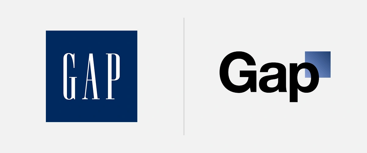
In October 2010, Gap unveiled its first logo change in more than two decades. The old design—a bold, white serif wordmark inside a solid blue square—was instantly recognizable and tied to the company’s identity as affordable American fashion. But leadership, facing declining sales after the 2008 financial crisis, wanted to look fresh.
The new logo featured Helvetica text with a small blue gradient box perched above the “p.” Gap’s president at the time, Marka Hansen, described it as a “more contemporary, modern expression” meant to shift the brand from “classic to sexy and cool.”
What Happened
The internet revolted. Within 24 hours, parody sites sprang up with thousands of alternative redesigns. Twitter users dubbed it “clip art chic.” Design blogs tore it apart as bland, corporate, and lacking soul.
By October 12—just six days after the launch—Gap announced it would revert to the old logo. What was supposed to be a confident step into the future turned into one of the fastest U-turns in branding history.
Why It Failed
The problem was never Helvetica. The problem was strategy.
Barry Enderwick, former Netflix marketing director, summed it up: “Rather than make a strategic shift followed by a signal that things have changed, they signaled first. It’s backwards.”
*On a completely unrelated note, Barry runs a wonderful Instagram profile where he makes all sorts of fascinating sandwiches. I only have a couple “must-see” accounts and his is one that I never miss.
Brand strategist Craig Smith echoed the same point: “The product positioning has to change first. Then, the logo should be the last thing you update to reflect that.”
Gap assumed that a new logo could magically fix deeper issues like slumping sales and brand irrelevance. Spoiler: it could not.
Lessons Learned
- 1
Logos carry emotional weight. Ignore that at your peril.
- 2A visual update is not a substitute for real business change.
- 3
Test with consumers before unveiling your “bold new direction.”
- 4
Be prepared for feedback. In the age of social media, you do not control the narrative.
Additional Reading on Gap’s Failed Rebrand:

Tropicana (2009): When Packaging Erases the Brand
Context and Intent
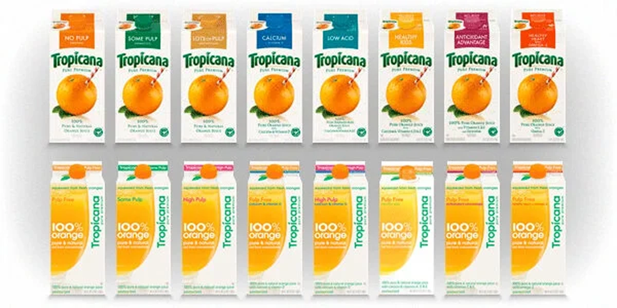
In early 2009, PepsiCo rolled out a redesigned package for Tropicana Pure Premium orange juice. For years, cartons had featured a simple but powerful image: a whole orange with a straw poked into it. That image wasn’t just design—it was shorthand for freshness and purity.
The redesign, led by agency Arnell, stripped away the orange-with-straw visual. It replaced it with minimal typography, lots of white space, and a generic glass of juice. The idea was to “modernize” and simplify.
What Happened
Within weeks of hitting shelves, sales dropped like a rock. Consumers couldn’t find Tropicana in crowded grocery aisles. Some bought competing brands instead. By February, PepsiCo pulled the redesign after sales fell 20 percent in just two months, representing a $30 million loss.
It was one of the fastest packaging reversals in recent memory, and for good reason.
Why It Failed
Tropicana’s new design didn’t just look different—it erased the distinctive brand asset consumers relied on to identify the product.
Marketing professor Mark Ritson called it “a disaster that perfectly illustrated how critical brand codes are to FMCG brands.”
The straw-in-orange image worked as a cognitive shortcut in a sea of competing juices. By removing it, Tropicana traded distinctiveness for minimalism. And in packaged goods, bland is not a strategy.
Lessons Learned
- 1
Packaging is functional design that helps people find you. Experimenting with creative concepts is fun, but make sure you understand the essence of how people identify your brand.
- 2
Distinctive assets are sacred. Remove them and you risk invisibility.
- 3
Minimalism can create confusion instead of clarity.
- 4
Always test packaging in the context where it matters—the shelf.
Additional Reading on Tropicana’s Failed Packaging Refresh:

Cracker Barrel (2025): Heritage Lost in Translation
Context and Intent
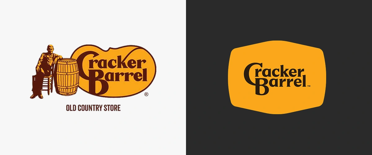
In August 2025, Cracker Barrel rolled out its first major logo change since the 1970s. Out went the familiar “Uncle Herschel” character leaning on a barrel. In came a flattened golden badge with only the words “Cracker Barrel.”
The move was part of a $700 million modernization effort under new CEO Julie Felss Masino. The goal was to streamline the brand for digital use and refresh the restaurant chain for younger audiences.
What Happened
The backlash was swift. Customers described the new look as “soulless” and “pitiful.” Social media erupted. Even the company’s 93-year-old co-founder weighed in, calling it “pitiful” and urging Cracker Barrel to “keep it country.”
The stock market wasn’t kind either. Shares fell 7 to 8 percent within days, wiping out nearly $100 million in market value. Political figures piled on, turning a logo change into a cultural flashpoint. Within a week, Cracker Barrel restored the old “Old Timer” logo.
Why It Failed
Gap misread modernization. Tropicana ignored distinctiveness. Cracker Barrel underestimated heritage.
David E. Johnson of Strategic Vision PR observed, “From a branding perspective, it was basically a flop. They went against their brand story.”
Carreen Winters, a corporate reputation expert, was more blunt: “If you are a legacy brand and you’re modernizing, you have to honor that legacy. Your stakeholders own your brand.”
The simplified design may have worked on an app icon, but it erased the Americana personality that defined the Cracker Barrel experience. Customers don’t go there for “bland digital convenience.” They go for comfort food, nostalgia, and rocking chairs.
Lessons Learned
- 1
Heritage is an asset. Treat it as carefully as revenue.
- 2
Modernization requires balance, not erasure.
- 3
Context matters. A rebrand during a rough patch looks more like panic than strategy.
- 4
If you get it wrong, a quick reversal can save you—but it’s far better to avoid the fire in the first place.
Additional Reading on Cracker Barrel’s Failed Rebrand:
Cross-Case Insights
These three stories play out differently, but the themes rhyme.
| Theme | Gap (2010) | Tropicana (2015) | Cracker Barrel (2025) |
|---|---|---|---|
| Core Intent | Modernize Logo | Modernize Packaging | Modernize Brand Identity |
| What Was Lost | Emotional Equity | Shelf Recognition | Heritage & Personality |
| Backlash / Outcome | Social Media Storm | $30M Sales Drop | $100M Stock Loss |
| Time to Reversal | 6 Days | 2 Months | 1 Week |
| Key Lesson | Test & Validate | Protect Identifiers | Honor Heritage |
Across industries, the message is consistent: design is not decoration. It is brand equity, consumer recognition, and emotional trust rolled into one.
Conclusion: Rebrands Are Not Cosmetic
Gap, Tropicana, and Cracker Barrel all wanted modernization. What they got instead was a crash course in the power of brand equity.
The lessons are straightforward but worth repeating:
- Respect legacy assets. Don’t strip away what makes you recognizable.
- Align design with strategy. A new logo will not fix an old problem.
- Test in the real world. A carton on a shelf or a sign on a restaurant matters more than a design deck.
- Communicate the why. Customers are more open to change if they understand it.
- Listen and adapt quickly. If you miss, pull back before the damage spreads.
At the end of the day, a rebrand should not just look better. It should work better. For your customers, for your culture, and for your business.
With over a decade of agency and in-house experience, Ben Huizinga is a creative and brand strategist focused on building brands that endure—crafting identities that make meaningful connections and stand the test of time. As Director of Brand and Creative at Young Marketing Consulting, Ben blends hands-on execution with high-level strategic thinking, helping organizations align their vision with the right voice, visuals, and experiences. He is also an experienced website architect, specializing in the development of beautiful, easy-to-use WordPress, Drupal, and Webflow sites that bring brands to life online. His work has shaped leading brands across the sustainability, technology, and nonprofit sectors—including Geothermal Rising, Echo Communications, and Bonterra, one of the world’s largest social good technology companies.
You might also be interested in these related articles:
A bloated RFP doesn’t guarantee a better website. It often guarantees safer, more generic proposals. Learn how to shift from feature checklists to clear outcomes and attract partners who think strategically, not just compliantly.
AI has made content easy to produce, but harder to differentiate. Discover why creativity, judgment, and taste are becoming brands’ most powerful competitive advantages again.


