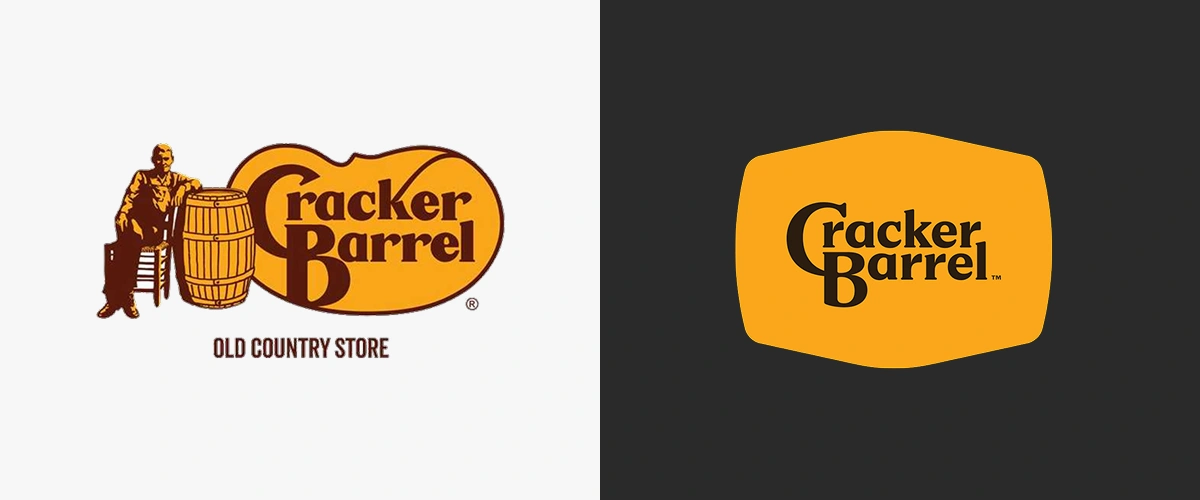
The internet had a collective meltdown last week when Cracker Barrel unveiled its first new logo since the Carter administration. Gone was the bearded man nostalgically resting on his namesake barrel. In his place: tidy lettering in a rounded golden shape that looks more suited for an app icon than a family-friendly roadside restaurant.
The backlash was immediate. Fans called it “soulless.” Critics called it “cold.” Shareholders called their brokers and Cracker Barrel’s stock plummeted 7.2% (almost $100 million dollars). And the rest of us were left wondering: why does every logo these days look like it was designed by the same intern with a basic understanding of Adobe Illustrator and a strangely robust grudge against serifs?
“Designers actually can change the world for the better by making the complicated simple and finding beauty in truth.” — Michael Bierut
The Great Logo Diet
Cracker Barrel isn’t alone. In the past decade, brand identities have been on what you might call a crash diet:
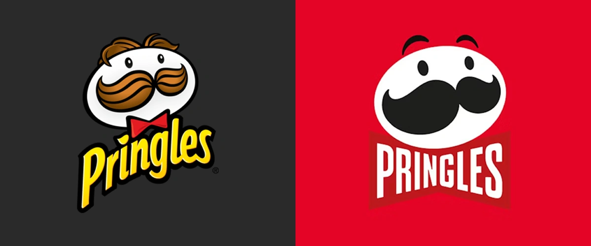
- Pringles shaved years (and hair) off Mr. P, streamlining his bushy brows into something closer to clip art.
- Dunkin’ Donuts dropped the “Donuts” entirely, betting that a caffeine-addled nation could make the leap.
- Burberry followed the rest of the fashion industry and traded in its iconic knight-on-horseback emblem for a stark sans-serif wordmark.
- Mastercard eventually dropped the wordmark altogether, letting its iconic red and yellow circles do the talking.

The logic is clear: cleaner marks scale beautifully across screens, stand out as tiny favicons, and look timeless enough to survive the whiplash pace of digital design. In a world where your logo might appear as a 16×16 pixel square, detail isn’t a luxury—it’s an obstacle.
When Simplification Makes Sense
Here’s the important caveat: for brands like Mastercard or Dunkin, simplification isn’t laziness. It’s luxury. These are brands with such deep equity that a circle or a single word can carry the entire identity. Everyone knows what those two overlapping circles mean. Everyone knows “Dunkin’” is shorthand for a caramel iced coffee bigger than your forearm.
When you’ve built that level of ubiquity, simplification can be a smart strategy. It pares away the unnecessary while keeping the essence intact. It’s the visual equivalent of Cher being able to go by… well, Cher.
“Design can be art. Design can be aesthetics. Design is so simple, that’s why it is so complicated.” – Paul Rand
But For Everyone Else…
Most brands aren’t Cher. They’re not Mastercard, Dunkin’, or Burberry either. For companies without global recognition, stripping a logo to the barest of elements can make it generic. And when your logo looks like it could belong to any bank, app, or coffee chain, you’ve lost the very thing a logo is supposed to give you: distinction.
That’s why simplification can sometimes feel more like a shortcut than a strategy. Building a robust logo system—a set of variations, lockups, and responsive designs that work in different contexts—takes effort. It takes discipline. It takes someone who cares about more than whether your logo fits neatly in a Twitter profile circle.
Cracker Barrel’s Crossroads
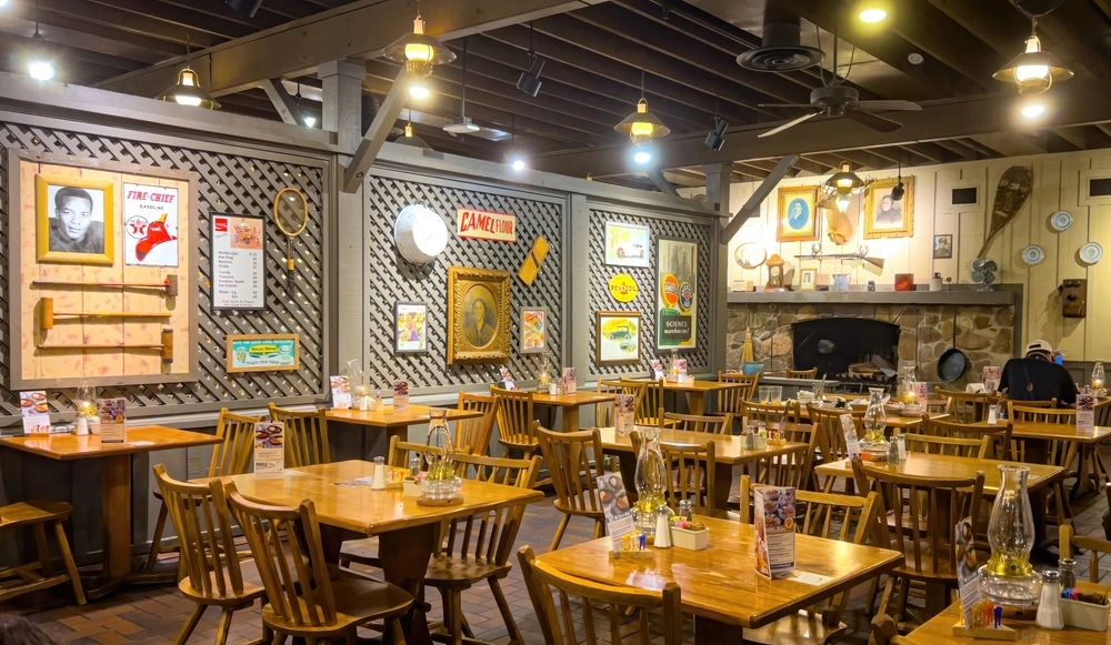
Which brings us back to Cracker Barrel. Their new logo undeniably solves some modern problems: it’s cleaner, scales better, and nods to their original 1969 wordmark. But it also erases a visual story that connected the brand to its nostalgic roadside roots.

The man and the barrel weren’t just decoration; they told you something. That you could expect a certain kind of old-fashioned hospitality. That you weren’t just walking into another chain restaurant. Simplifying a logo isn’t inherently bad, but when it comes at the expense of what makes your brand memorable, you risk flattening more than just your design.
The Takeaway
Simpler logos aren’t going away. In fact, they’re often the right move—if your brand has earned the kind of cultural shorthand that allows you to stand on shape and color alone. But for most companies, the safer bet is to invest in a flexible logo system that preserves your personality while adapting to the demands of the digital age.
Otherwise, you might find that in chasing minimalism, you’ve minimized yourself right out of recognition.
“Like a logo, simple shapes mean nothing to anyone on day one. It’s all about being identifiable.” – Bill Kenney, Focus Lab
Further Reading
- P gets a haircut in “simplified” Pringles rebrand
- Dunkin’ drops ‘Donuts’ from its name in new branding
- Burberry drafts Peter Saville for a simplified graphic identity
- Cracker Barrel’s New Modern Logo and Aesthetic Become a Political Rorschach Test
- Cracker Barrel unveils new simplified logo: ‘Our story hasn’t changed’
- Oversimplified logos: Clarifying the simplified logo trend
- Why Brands are Simplifying Their Logos and Visual Identity
With over a decade of agency and in-house experience, Ben Huizinga is a creative and brand strategist focused on building brands that endure—crafting identities that make meaningful connections and stand the test of time. As Director of Brand and Creative at Young Marketing Consulting, Ben blends hands-on execution with high-level strategic thinking, helping organizations align their vision with the right voice, visuals, and experiences. He is also an experienced website architect, specializing in the development of beautiful, easy-to-use WordPress, Drupal, and Webflow sites that bring brands to life online. His work has shaped leading brands across the sustainability, technology, and nonprofit sectors—including Geothermal Rising, Echo Communications, and Bonterra, one of the world’s largest social good technology companies.
You might also be interested in these related articles:
A bloated RFP doesn’t guarantee a better website. It often guarantees safer, more generic proposals. Learn how to shift from feature checklists to clear outcomes and attract partners who think strategically, not just compliantly.
AI has made content easy to produce, but harder to differentiate. Discover why creativity, judgment, and taste are becoming brands’ most powerful competitive advantages again.


